PXL Crop and Resize
Most images are set up to use Terminalfour's CDN/PXL feature. The PXL service takes care of resizing and cropping for you. This allows you to upload a full size version of an image, PXL will resize and crop the image to the dimensions required for the content type. If any cropping occurs PXL will crop from the middle of the image.
For each content type that uses an image you will find guidance on the minimum dimensions of an image to upload, the rest is done for you.
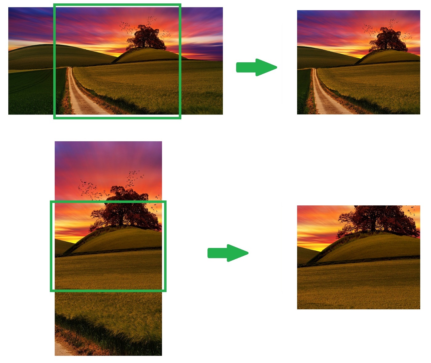
Example - PXL Crop and Resize
Using the Carousel - Gallery v2 content type as an example. The design for this requires an image that is 1000px x 845px, therefore the guidance recommends uploading an image that is at least 1000px x 845px. The image can be any size, and any aspect ratio.
If you uploaded a landscape image that is 2000px x 1000px, after PXL resizes the height to 845px the image is wider than the size required. PXL crops horizontally from the middle of the image to create an image the required aspect ratio.
If you uploaded a portrait image that is 1000px x 2000px, here the image is taller than the size required. PXL crops vertically from the middle of the image to create an image the required aspect ratio.
See screenshots below showing the original images on the left with a green outline showing where they will be cropped. On the right is the end the result: new 1000px x 845px images cropped and resized from the originals.
See the following where the Carousel - Gallery content type is using these 2 example images:
Example - Different Image for Mobile
Some content types have images where on smaller screens like mobile devices we need to use an image that is a different aspect ratio to the image we show on larger desktop screens.
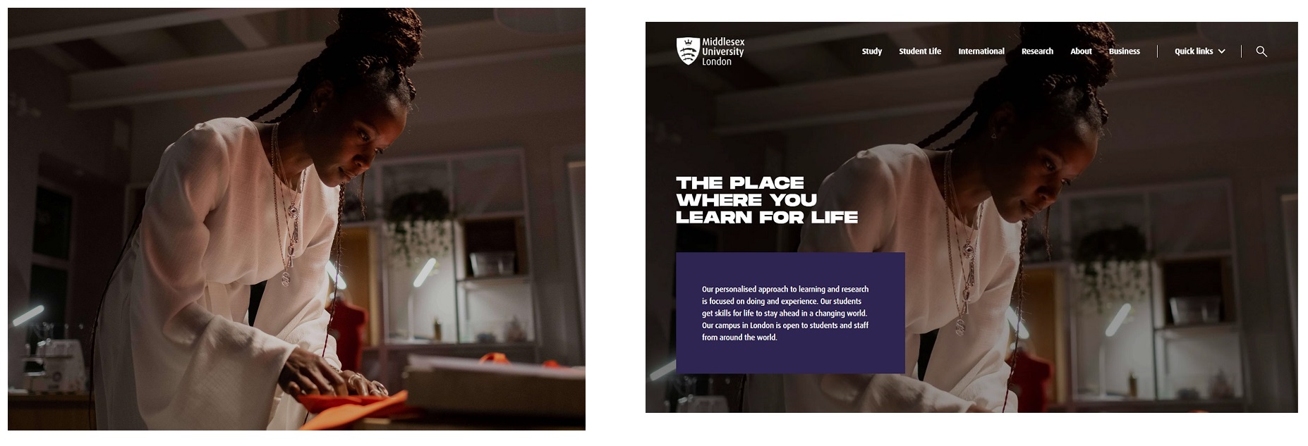
Take the Secondary Masthead content type as an example. On desktop with the screen being wide the image used is 2200px x 1610px and landscape:
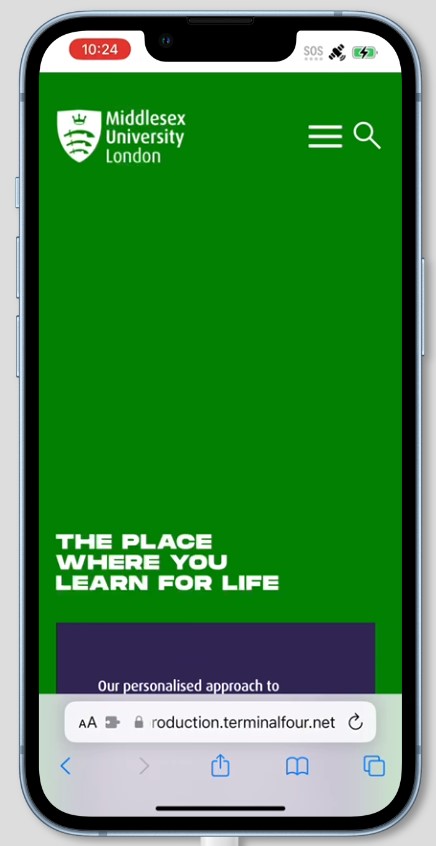
On mobile devices the space required for this image is a different orientation, a portrait image is required. See the space highlighted in green:
PXL creates a 780px x 1688px image for use on smaller screens for you from the full size image you upload. It is important that the focus of the image is in the centre, as starting from the middle point of the image PXL crops the new image required. See the green outline in the following screenshot which shows an example of how a full size image is cropped for mobile:
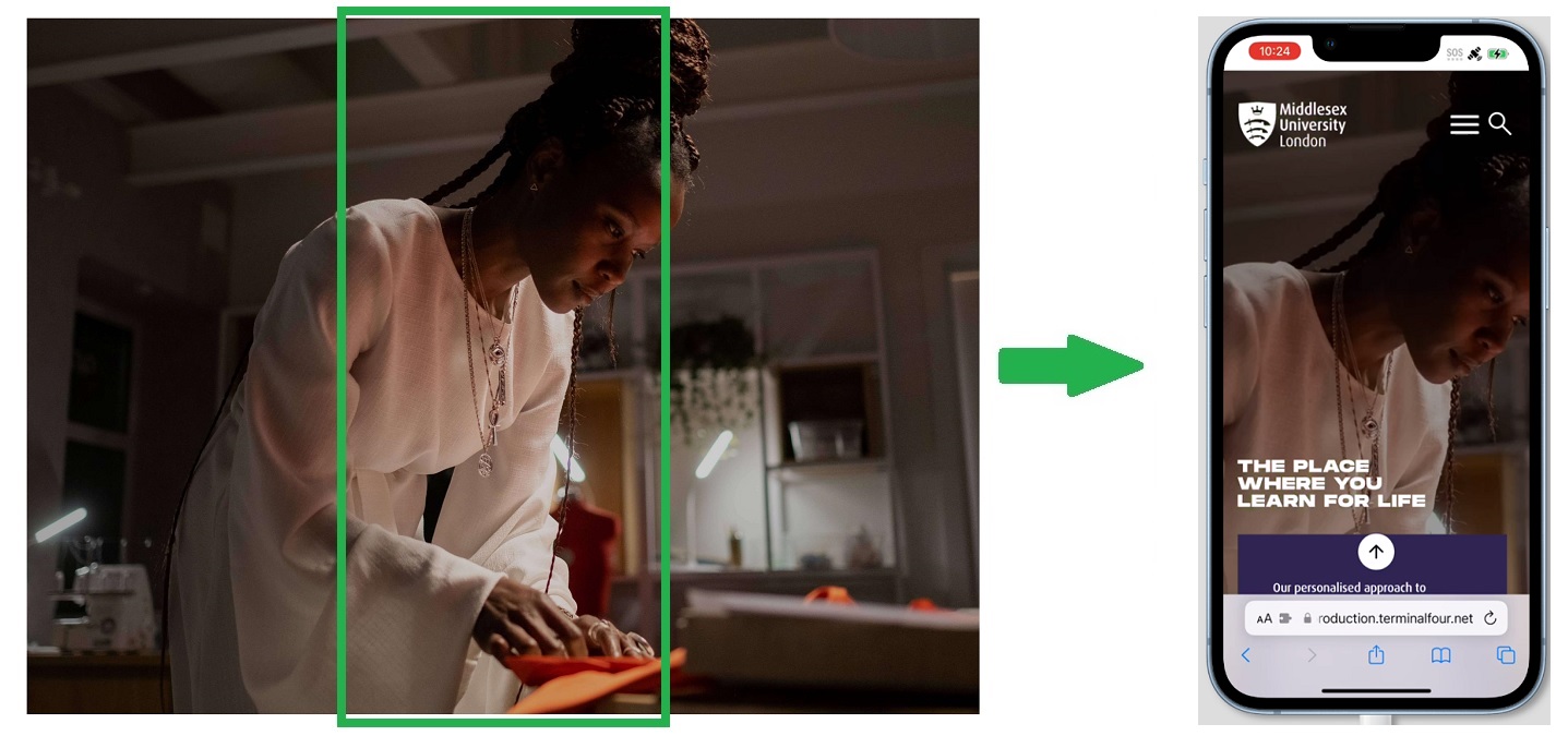
See Secondary Masthead example in practice.
Content types which have different aspect ratio images for mobile detail this in the component library guidance.
Carousel - Gallery PXL Resize and Crop
/409x0:1592x1000/prod01/channel_3/media/middlesex-university/site-assets/component-library/page-designs/demo-pxl-landscape-image.jpg)
/0x578:1000x1423/prod01/channel_3/media/middlesex-university/site-assets/component-library/page-designs/demo-pxl-portrait-image.jpg)