Text Over Images
The design of the some content types requires text to be placed over an image.
When choosing an image you need to be aware of this to ensure the contrast ratio around the text meets accessibility requirements. The content types used larger text which requires a contrast ratio of over 3:1.
A manual check can be run on content using the Accessibility Insights for Windows tool Color Contrast Analyzer function.
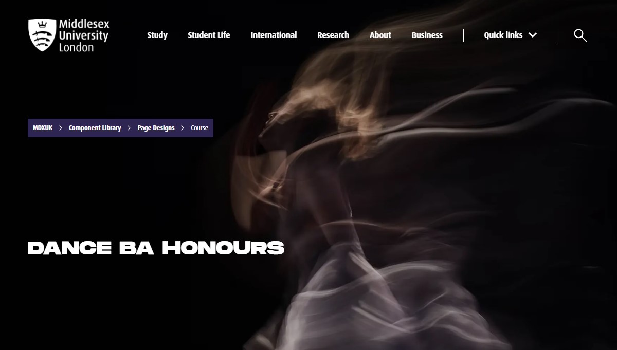
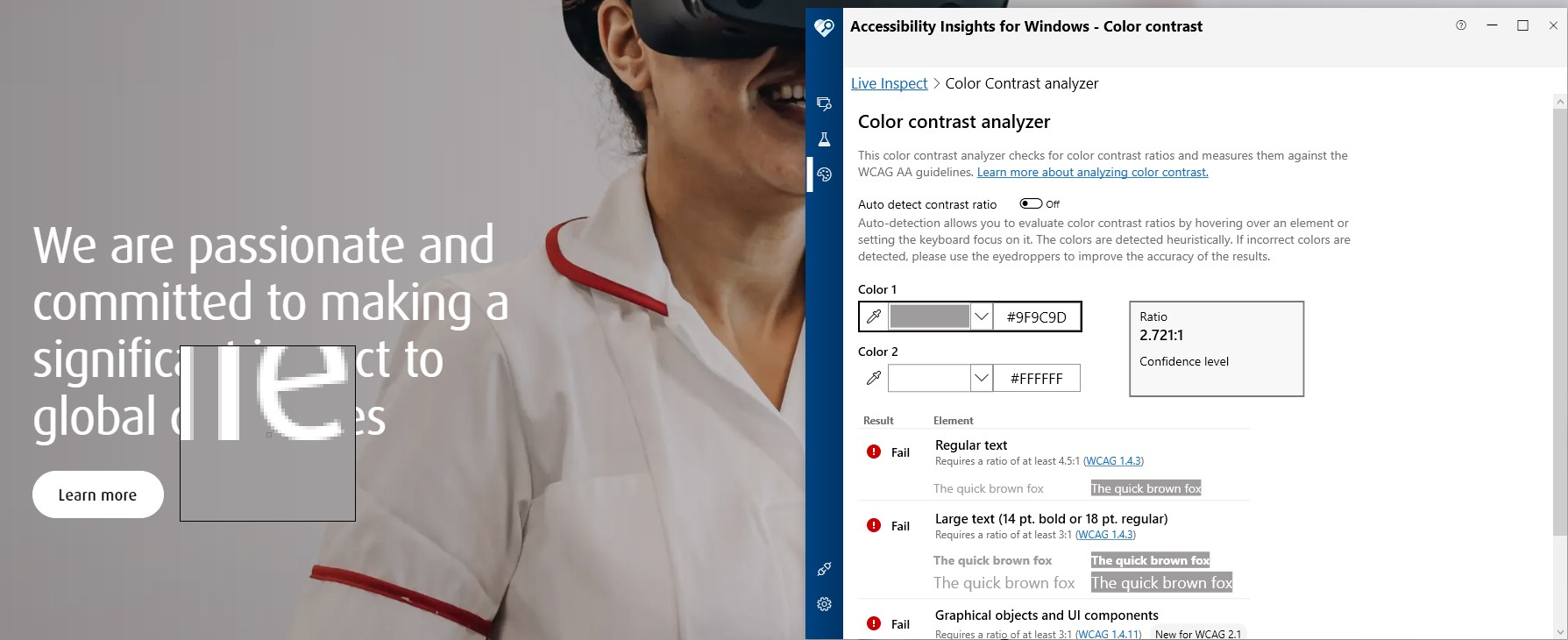
Take the following Course as an example, where in the Masthead the Course Name is placed over the Background Image:
Set Color 1 to the color of the text e.g., white #FFFFFF. Using the eye drop for Color 2 move around the edge of the text, the color and ratio updates as the cursor is moved to allow a manual check to take place. You can see from the following screenshot that the colour contrast ratio around the text is comfortably above the ratio required:
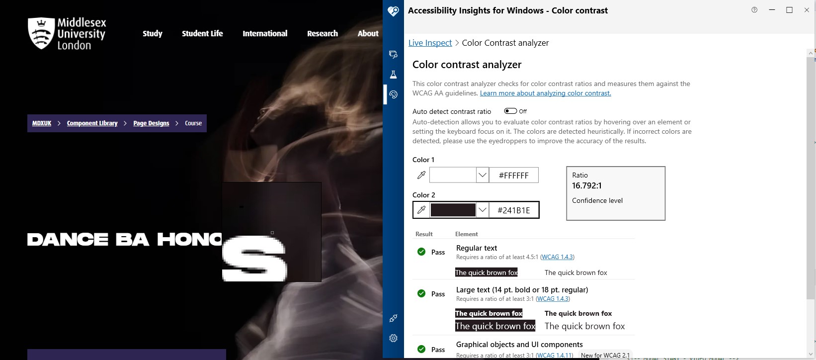
Image Overlay
When a lighter image is used this can cause the contrast ratio to fall below the required level. In cases like this there is an Image Overlay element which provides the option to add either a light or dark vignette over the image to improve the contrast ratio. Depending on the image choose a suitable option.
Content types which are this option are:
- Decision Tree
- Explode Panel
- Featured Panel
- General Info - Small Panel
- Secondary Masthead
- Testimonial Full Width Carousel
- Video Panel with Links
The Course content type has an Image Overlay element, but based on the design of the Course Masthead being slightly different the options are to add a Full or Partial overlay.
Featured Panel Example
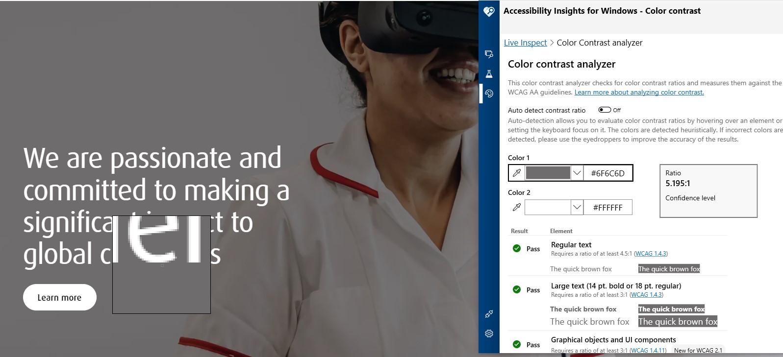
Take using the following image for example with the Featured Panel content type:
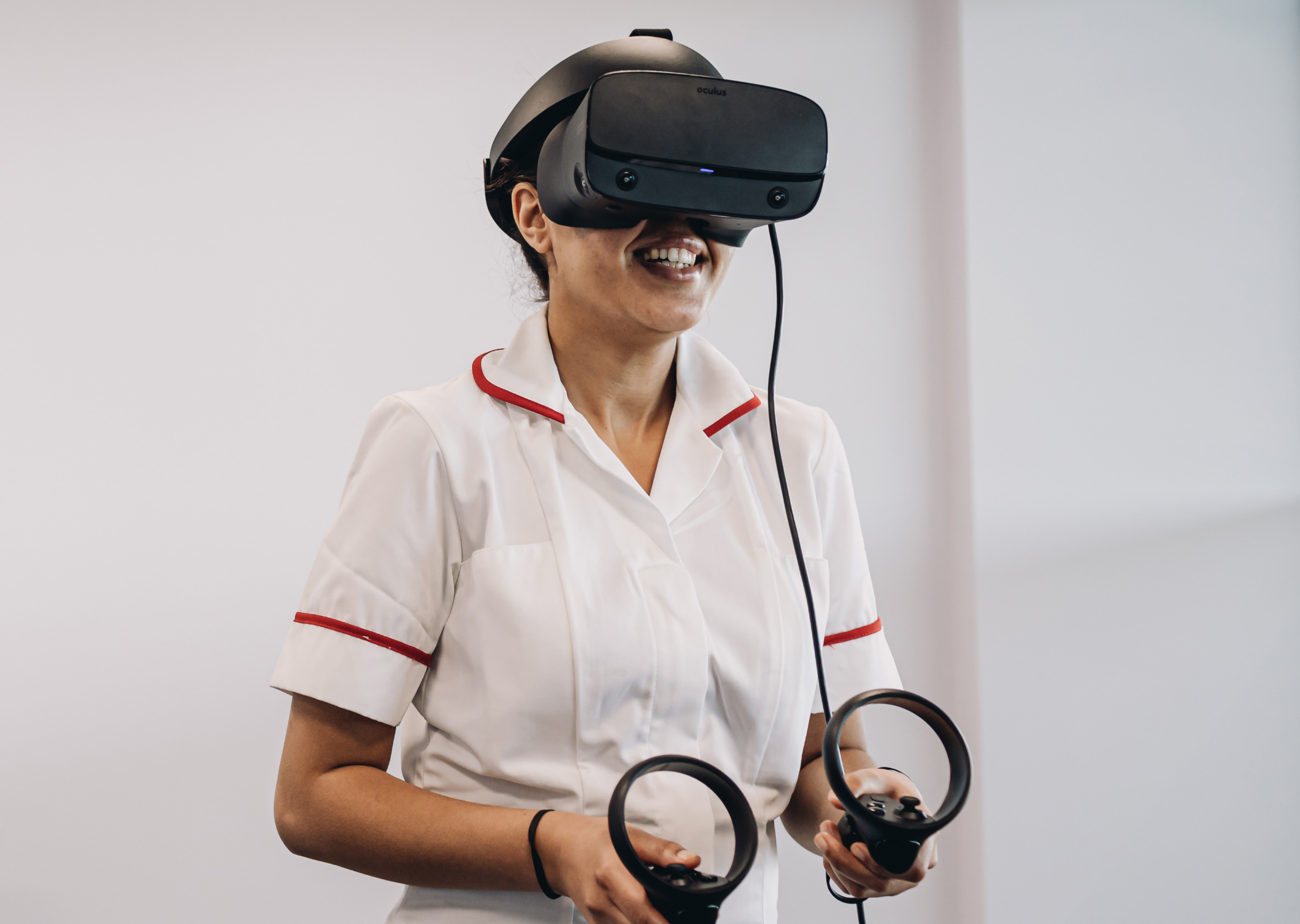
Here you can see how the contrast ratio is below the required 3:1 ratio for larger text:
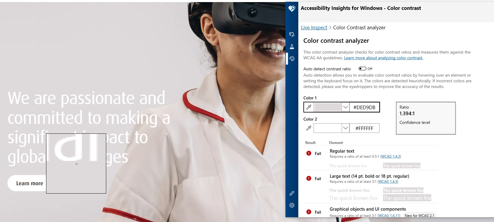
With this image using the light Image Overlay option still leaves the contrast ratio below 3:1:
Here as the image is very light the dark Image Overlay option is needed to get the color contrast above the required ratio:
See the following Featured Panel content items used the same image with the different Image Overlay options applied and what effect this has:
No Image Overlay
/58x0:4038x2913/prod01/channel_3/media/middlesex-university/site-assets/component-library/page-designs/scroll-expand-ph-2.4e376820.jpg)
We are passionate and committed to making a significant impact to global challenges
Learn moreOur students get skills for life to stay ahead in a changing world. Our campus in London is open to students and staff from around the world. At Middlesex, we’re a global family with a shared vision of a world that's fairer and more inclusive.
Light Image Overlay
We are passionate and committed to making a significant impact to global challenges
Learn moreOur students get skills for life to stay ahead in a changing world. Our campus in London is open to students and staff from around the world. At Middlesex, we’re a global family with a shared vision of a world that's fairer and more inclusive.
Dark Image Overlay
We are passionate and committed to making a significant impact to global challenges
Learn moreOur students get skills for life to stay ahead in a changing world. Our campus in London is open to students and staff from around the world. At Middlesex, we’re a global family with a shared vision of a world that's fairer and more inclusive.